Modernizing FileMaker’s legacy inspector into a contextual, streamlined panel that reduced clutter, minimized tab switching, and improved workflow efficiency, shifting the project from a simple visual refresh to a full UX initiative.
Overview
My Contributions
• Reframed scope of the project from a visual refresh to a UX redesign.
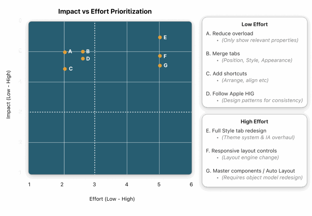
Merge tabs – Position, Style, Appearance tabs into one.
Add shortcuts for frequent actions (arrange, align, visibility).
Defer full Style tab redesign etc (too engineering-heavy).
Matrix: Impact vs Effort Prioritization
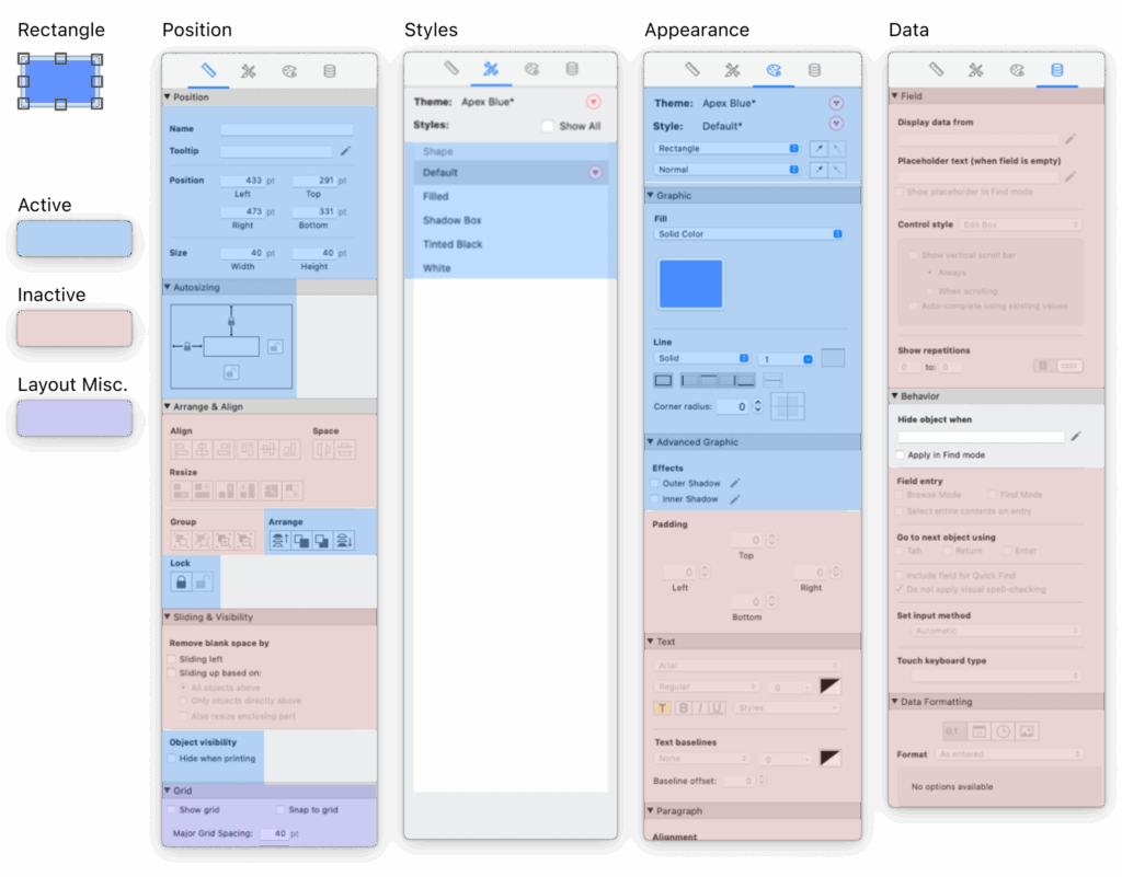
Property panel audit
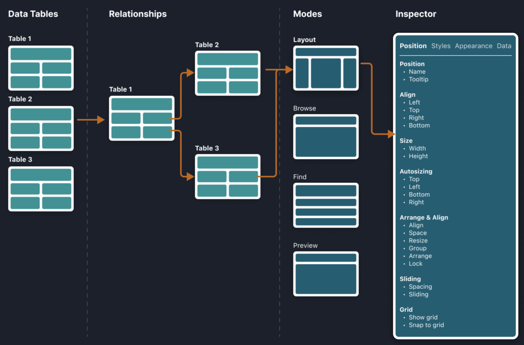
System Mapping & Audit
Mapped out property editing workflows to identify consolidation opportunities
Ensured proposed changes wouldn’t disrupt other system areas
Audited each toolbar object → flagged relevant vs. irrelevant properties.
58 Total object properties.
Mapped out property editing workflows
Ideation
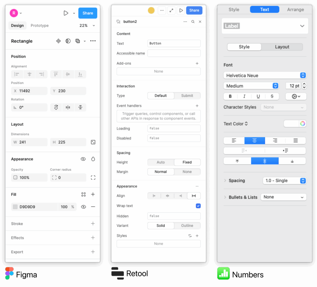
Benchmarking
Figma: Contextual right panel only shows properties for selected objects
Retool: Consolidated tab structure, efficient for developers
Apple Numbers: Minimal, Apple-aligned inspector patterns
Key insight: Best-in-class tools reduce clutter by contextualizing properties and minimizing navigation
Comparative Analysis
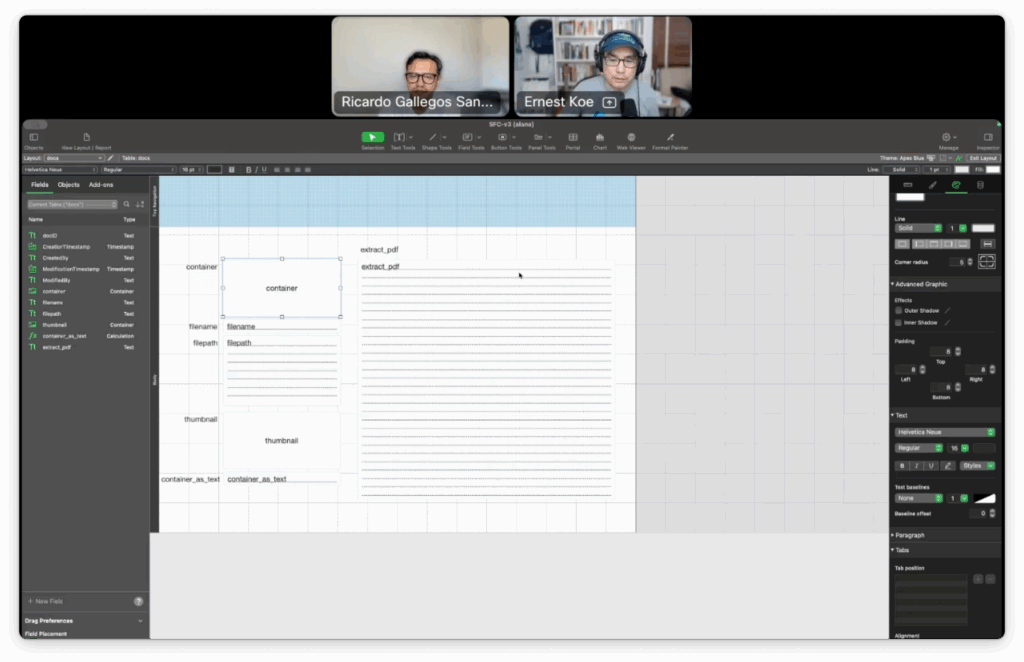
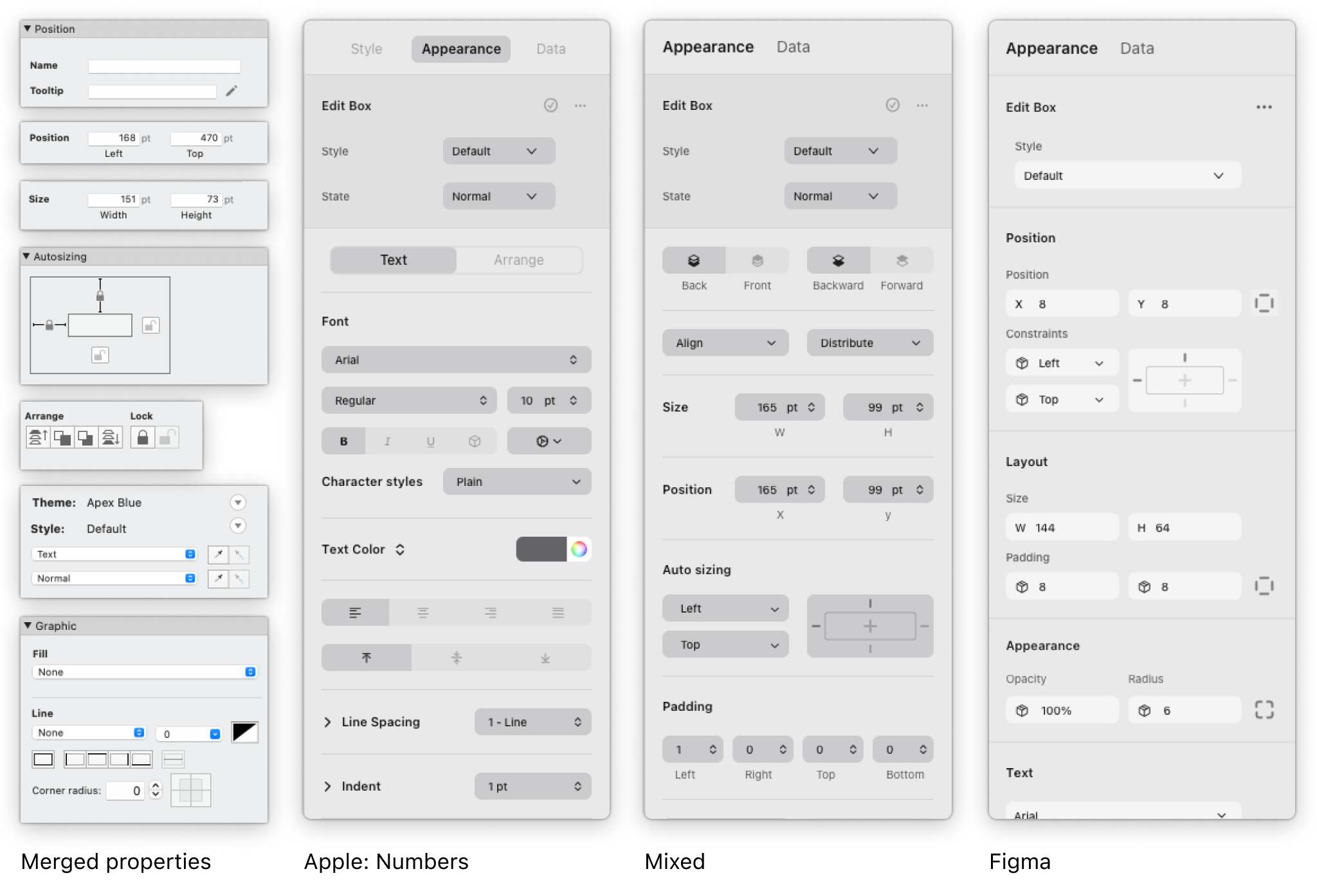
Wireframes
Created multiple lo-fi wireframes exploring merged tabs and contextual inspector
Reviewed with design + engineering for feasibility
Shared wireframes in bi-weekly “Kitchen” sessions with customers
Iterated based on direct feedback
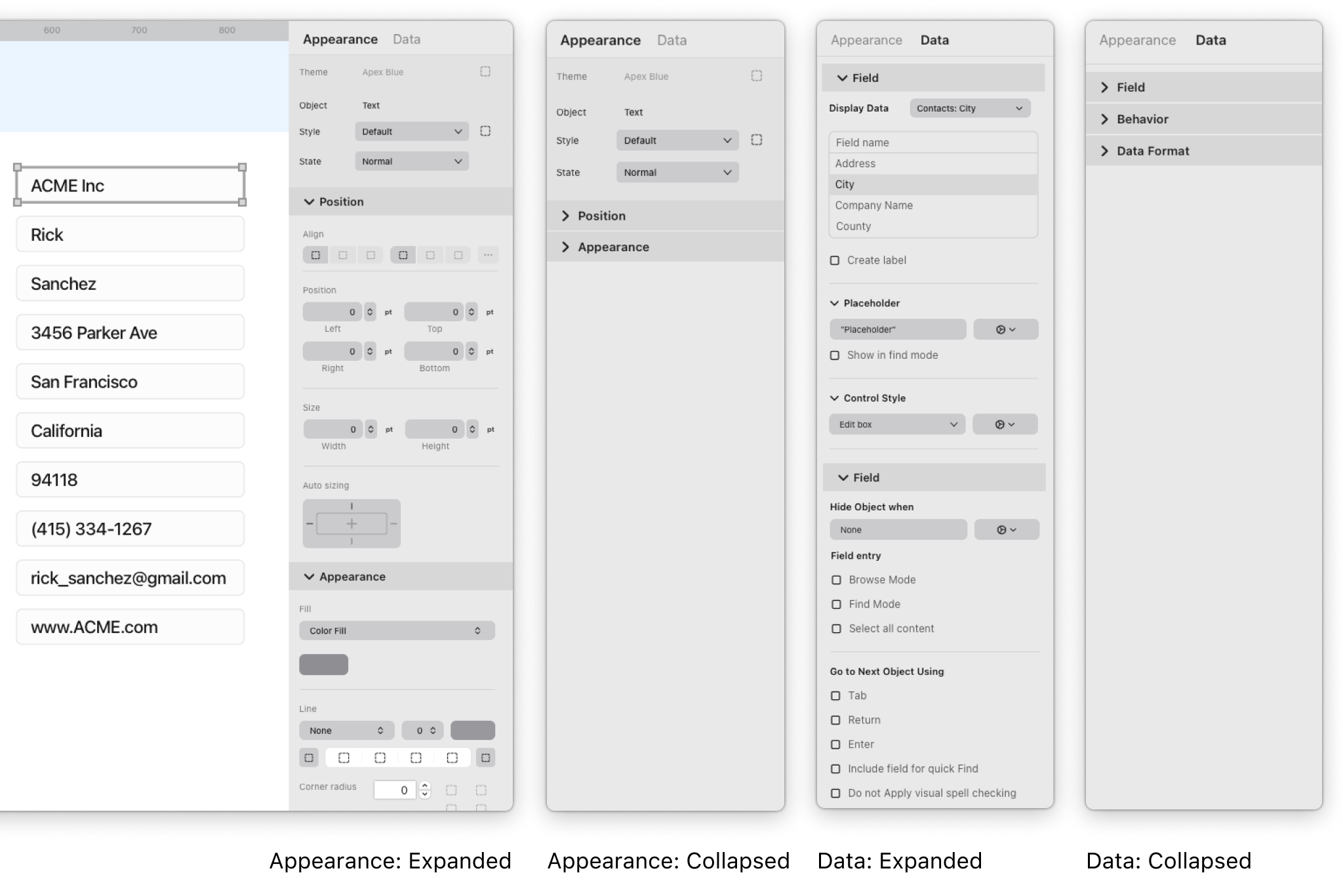
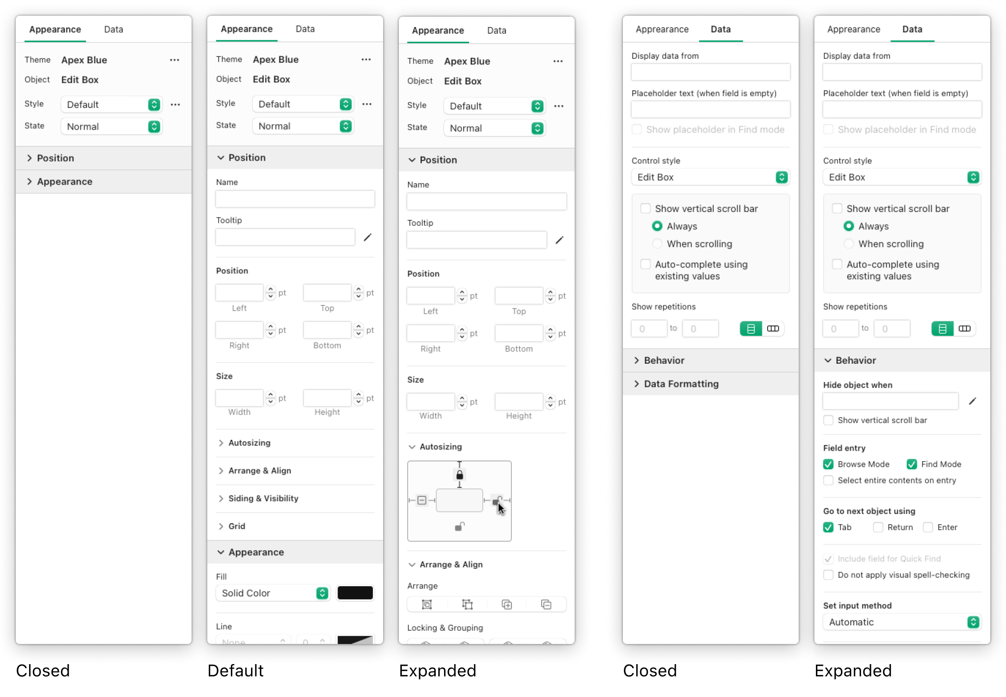
Wireframes smart inspector
Design Solution
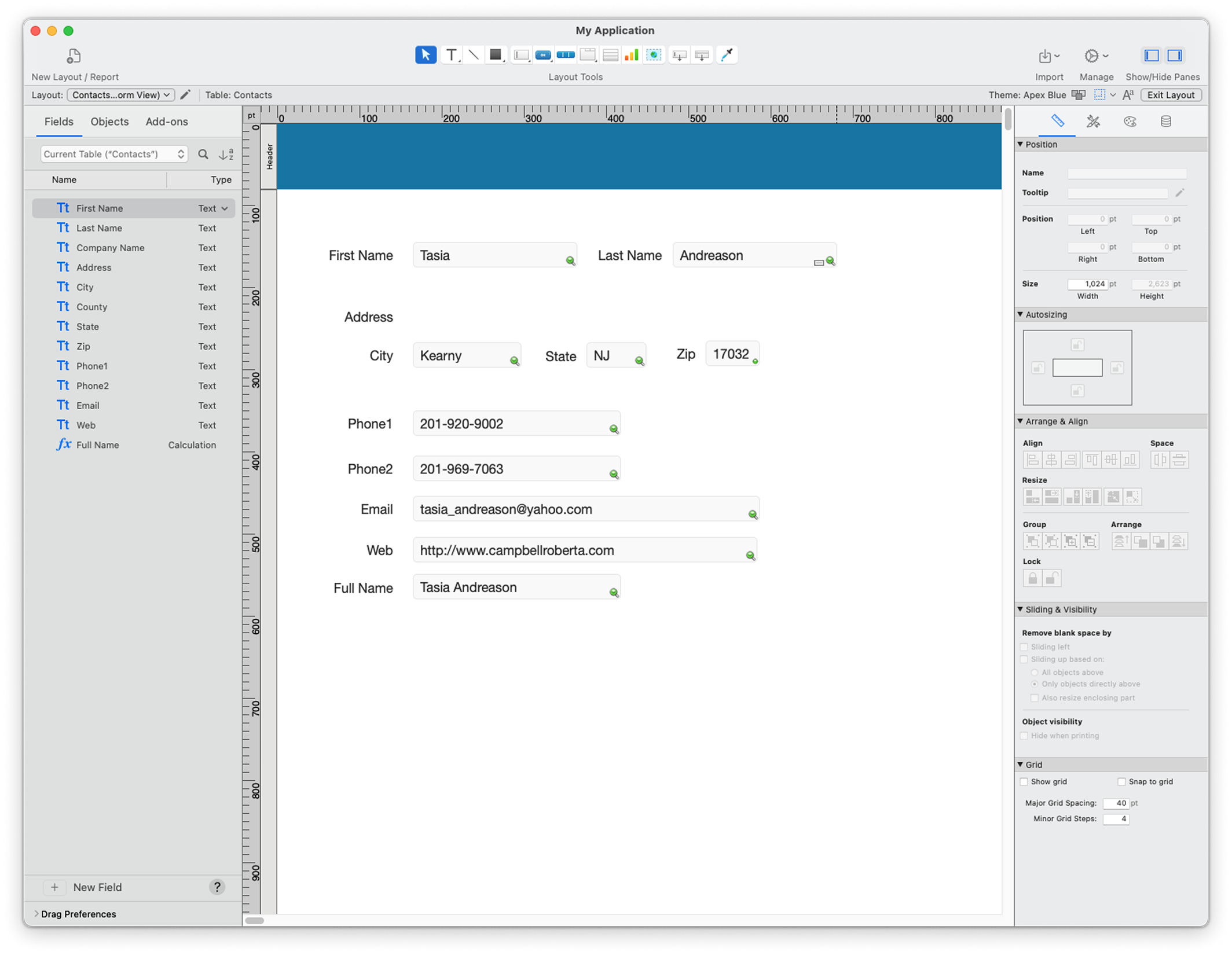
Legacy Inspector → Smart Inspector
Reduced tabs from 4 → 2:
Appearance = merged Position + Style + Appearance
Data tab unchanged
Inspector became context-aware: only shows relevant properties
Introduced shortcuts for frequent actions
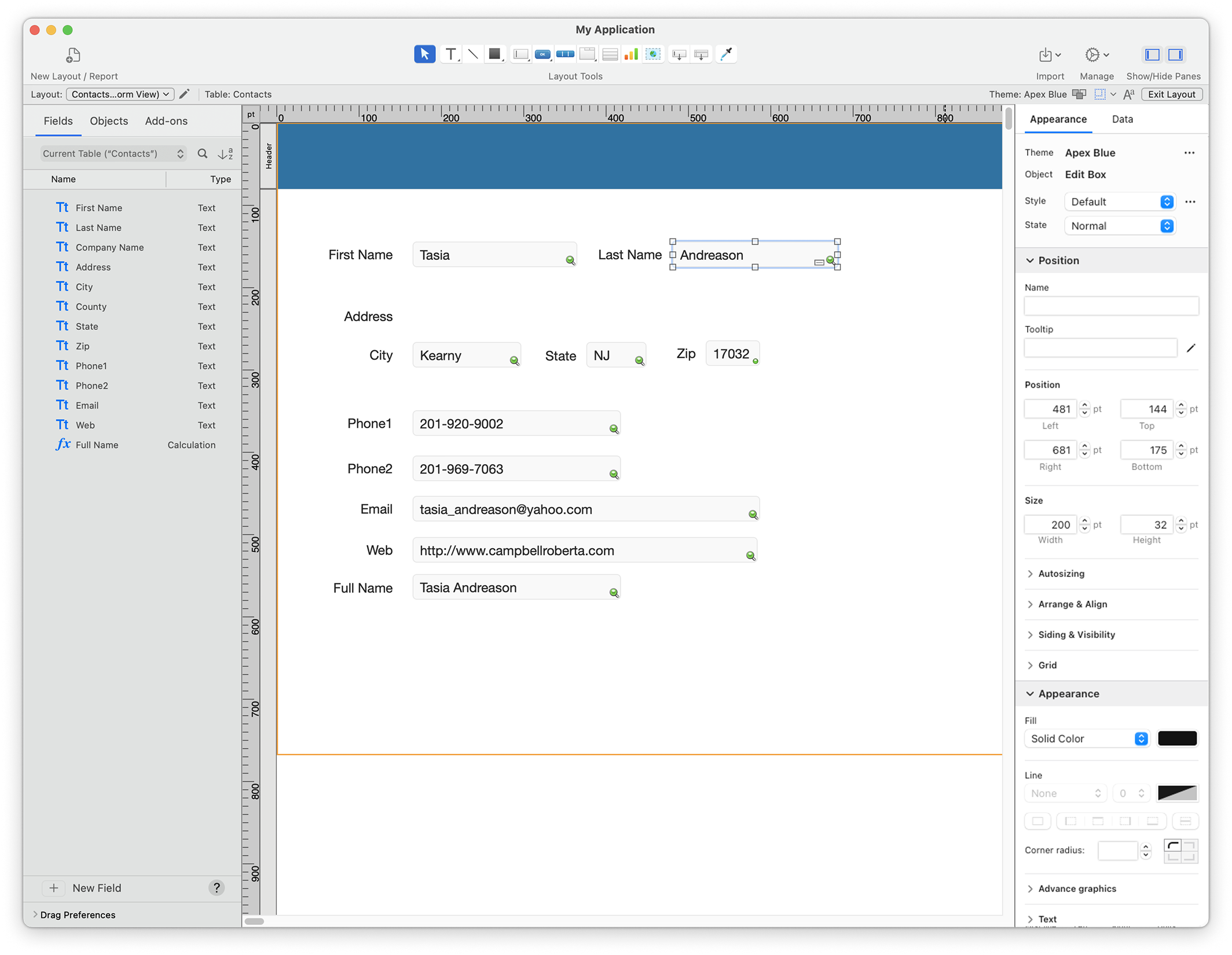
Final UX designs
Execution
Paired with visual team → finalized icons, system colors (dark mode ready)
Mentored design team in Xcode/AppKit → improved feasibility
Built the front-end in Xcode/AppKit → engineering focused on backend wiring
Hi-fi Final Design Visual Collaboration
Outcomes
User Impact
Reduced cognitive load and tab switching, improving efficiency and making workflows more approachable for new and experienced developers.
Team Impact
Enabled design team to deliver more feasible solutions by aligning with engineering constraints (system colors, AppKit patterns), accelerating delivery by 2 months.
Release
Shipped in FileMaker Pro v26.0 as a major update to Layout Mode — the first visible step in modernizing a 20+ year legacy platform and laying the foundation for future usability improvements.