Client Dashboard Redesign
Empowering clients with real time event reporting.
Live demand, supply and revenue breakdown.
Self-serve inventory management.

Summary
What was delivered
Services
• User Interviews
• Comparative Analysis
• Component Audit
• Responsive Design
• User Testing
Deliverables
• User Flows
• Hi-fi Wireframes
• Hi-fi Prototypes
• Data Visualization Color Palette
Outcome
• Empowered clients with a self-serve dashboard that provides real time, attendance reporting, operational out of the box recommendations and revenue analytics. Eliminating the need for customer service managers for every actions.
• Includes pre-sale feature that allows clients to gauge fan demand before a show go live.
Understanding the problem
Outgrowing your product
Scaling Pains
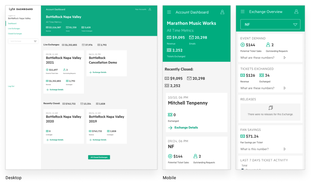
Lyte’s client dashboard was designed and built to help small venue clients monitor single day events and quickly get a glimpse into revenue totals.
Lyte’s client base has rapidly grown over the years and now includes multi-day festivals and world tour clients. The current client dashboard doesn’t provide the critical insights needed for these new clients and consequently the current dashboard required a redesign.
Understanding Clients
I spent the next two weeks in discovery mode, conducting user interviews with Lyte’s business leads, external clients and customer service managers. Identifying Lyte’s business requirements and illuminating client pain-points, needs and wants for the new dashboard.
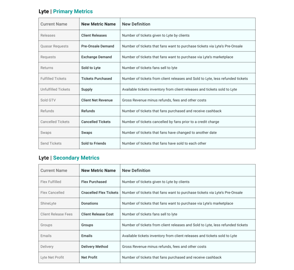
Terminology Audit
Throughout the dashboard, key performance indicators provided inaccurate calculations and weren’t properly defined. I audited all dashboard KPI’s and collaborated with lead data scientist to define, create and standardized key performance indicators for the new dashboard and internal platform.
The Solution
Self-Serve Dashboard
New Dashboard Layouts
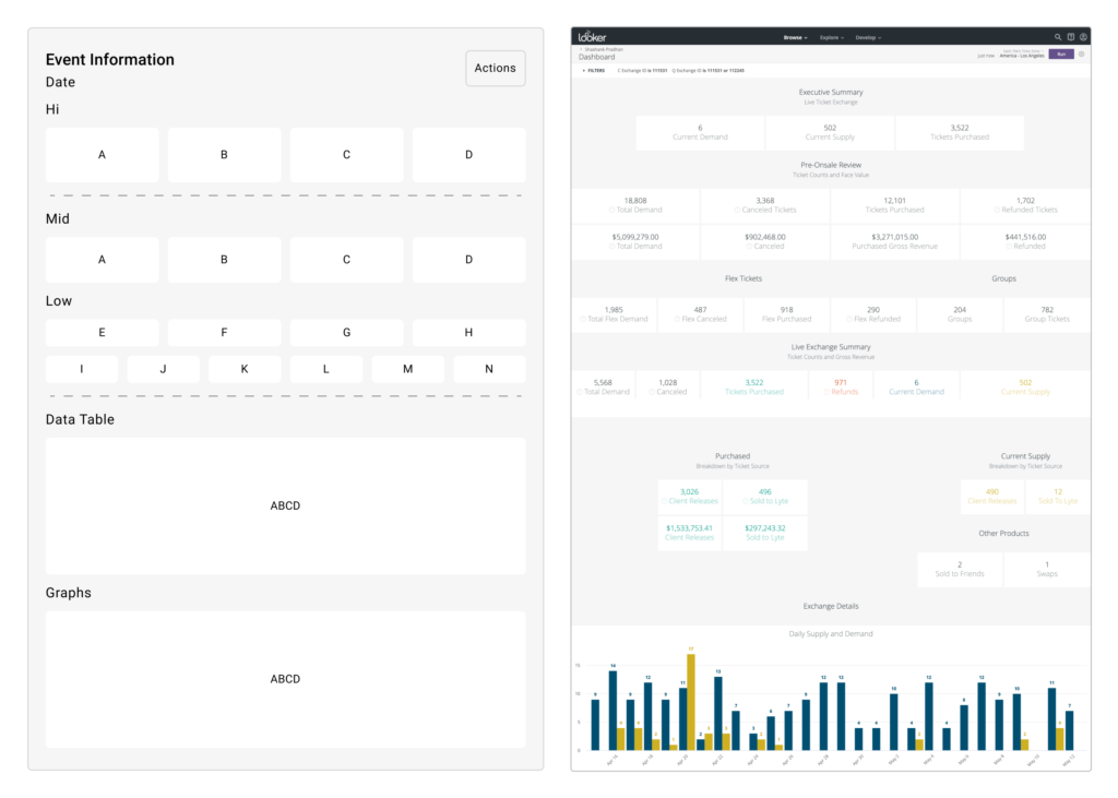
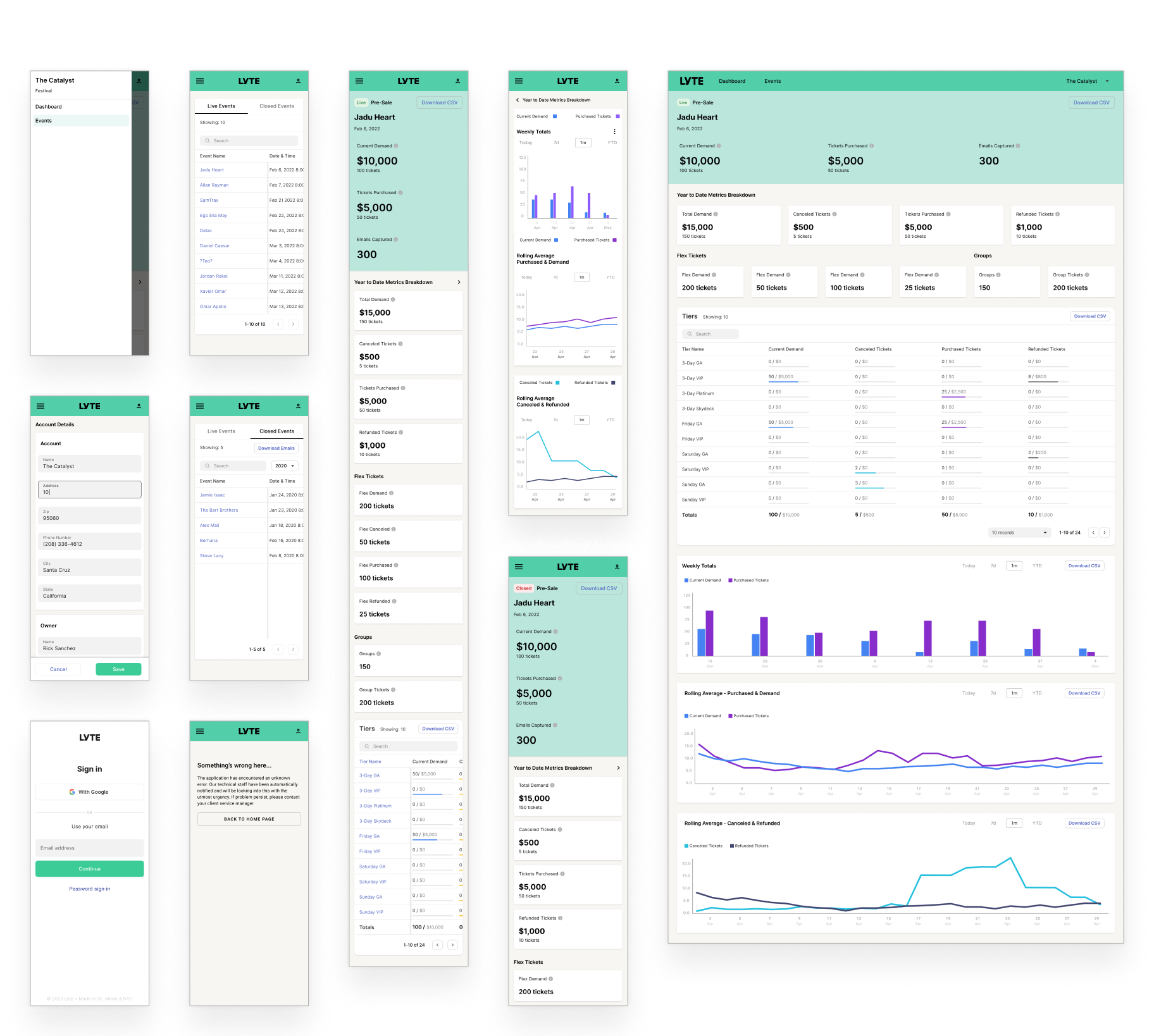
Spending a few days brainstorming layout ideas with my team, I created a funnel-like layout that broke down event KPI by high, mid and low priority. I created a layout that’s easy navigate, understand and provides clients with quick glimpse into their events.
Granular Details
To help clients read and dig deeper into event data, I added a sortable data table with ticket type breakdowns, line & column graph designed to reveal trends or changes overtime.
“I want to quickly understand what’s happening with my event and how much I’m making.”
Coachella Festival Director
Adding a New Product
Lyte’s leadership team created a new product vertical called Pre-sale that will be an essential part of the new client dashboard. The new Pre-Sale product allows venue, festival and artists to gauge fan demand before an event goes live. After understanding the product requirements and goals for the new product, I used the same funnel like layout to keep consistency.
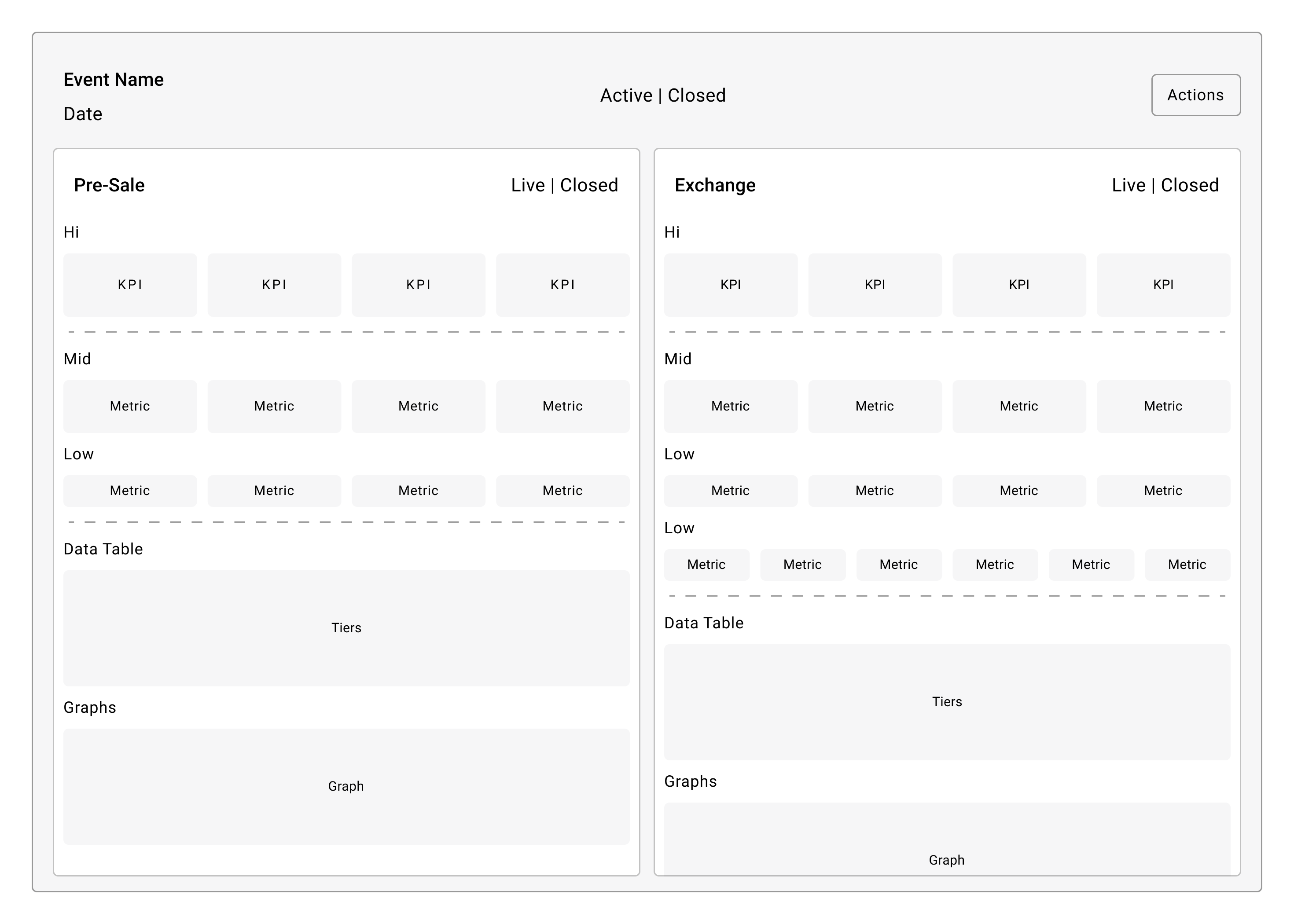
Updating Existing User Flow
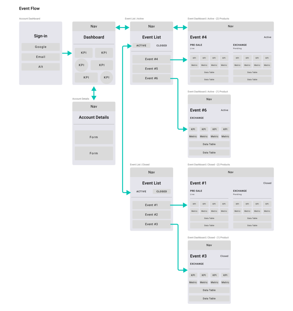
Reviewing the new Pre-Sale product layout with clients, I discovered the inability to navigate between Pre-Sale & Exchanges products. Mapping out the existing user flow helped me determine the need to restructure the existing user flow and streamline the existing navigation.
Comparative Analysis
With limited direct competitors, I widen my search and focused on analyzing indirect competitors who provided me with useful ideas and insightful features, such as data table layouts, navigation responsiveness and component interactions.
I worked with team to review, verify constraints and feasibility for all ideas and features. The few features that made the cut were added into the new dashboard design.
Responsive Design
Clients wanted a quick way to check in on events via mobile phone. I sketched out layouts following Google Material Design guidelines, I created a responsive layout with established minimum and maximum dimensions for body and margins, as well as responsive column grids to ensure a logical and consistent layout across screen sizes and orientations.
Branding
Using Lyte’s existing design system, I carefully applied color to the new dashboard. Creating a color theme that indicates which components are interactive, how they relate to other components and their level of prominence.
Additionally, I created an equidistant color palette for our data visualization components, that make it easier to tell colors apart in a graph and easily compare them to a key.
Design System
Collaborating with developers & data scientist, I designed and created data driven components, such as data tables, data graphs and data card layouts. All data components were then added to Lyte’s existing design system.
Outcomes
Dashboard

Self-Serve
Empowered clients with a self-serve dashboard that provides real time, attendance reporting, operational (out of the box) recommendations and revenue analytics. Eliminating the need for customer services managers for every action.
User Flows

Streamline
Created responsive user flows for clients and customer service managers that make searching, navigating, reviewing events and switching accounts quick and easy.
Prototype

Guide
Created hi-fidelity prototypes to conduct user testing and validate design. Prototypes were further used by developers to help guide during the dashboard development.
Design System

Contributing
Extended existing design system by standardizing responsive layouts, design components and color palettes focused on data visualization.